Sunday, 7 February 2016

Scottish Tower House, another go

I tried to make a tower house at Christmas, but it was a rush job and turned out pretty badly. It's been bothering me ever since, as I just knew I could make a better job of it.  So this weekend, when I really should have been catching up on housework and doing a proper supermarket shop, I sat down and made another.

Scottish tower houses are really little castles. There are quite a few of them around East Lothian (where I live) and many of them were until recently just ruins, four walls, no roof or floors. But over the last 20 years or so some lovely people have come along and rescued them.  I think it must be magical to live in one of these homes. Not too big and not too small, usually locatedk in an elevated position with a lovely view.  I can dream.


Anyway, my house is based on Tim Holtz Village Dwelling die, but I've made this into a 3 storey building using an extra layer of card at the base and building up 2 layers of houses, and added a circular stair tower with a turret. I also decided to make an enclosed courtyard at the back.   


I went over the walls with a very thin layer of DecoArts texture paste to look like the harling you find on these buildings, and then painted with American craft paints.


 The stonework, including the stairs and coping stones on the wall around the courtyard is all mmade from grunge board, I've used various colours of distress inks and pens to add colours on walls, roofs and in the courtyard.

I wanted to put some kind of decoration on the front of the building.  This is actually a plastic button that has been covered in gesso, painted to match the wall and embellished with a very tiny black and white coat of arms.


I'm glad I did another of these, I'm pretty pleased with this one.

Tuesday, 2 February 2016

Wee Country Cottage.

Still obsessing about little houses, so here is another experiment. It didn't start off looking like much, as I wasn't really planning to do what I ended up with.  I used a bit of cardboard that came from some packaging to cut some of the village dwelling house shapes from, cut them up a bit, stuck them together and it just sort of grew into a not quite 3D version of a friend's lovely little cottage.


Because I used striped cardboard, and the patched bits were fairly obvious I covered the lot in texture paste from DecoArts. It clogged up the windows a bit so once it was dry I had to go over each window to clear the excess paste. Neat I am not.

I have forgotten take any further photos of the process. Doh. But what I did was put a layer of gesso all over then painted the stonework with various paints ( American crafts and ranger distress colours). I went on to google street view to get a good idea of what the cottage looks like and tried to stick to that as far as I could.

The window frames are from Tim Holtz village winter die, and I used some frosted paper behind them.


The green plants growing up the walls are made using some fluffy stuff I was given by my sons partner Jill. I think it was originally intended for use on fingernails, but not sure if that's right and NO idea what it is called.

I used vintage photo distress embossing powder to make the gravel at the front of the house. And the doorstep is a small square of grunge board. I coloured this with some distress inks, and also used a distress pen to colour the brick edge. Also a distress blue pen around the Windows.

It wasn't planned that way but the finished cottage fitted perfectly into an IKEA frame. I added a torn paper landscape behind (pretty much the view from the back garden, of Garleton Hill and the Hopetoun monument near Haddington ) and gave it to my friend who was thrilled with it.


I've now got an order from a friend who lives in a thatched cottage with dormer Windows. I think I will have to wait for Tim's new village dwelling release, which has a dormer window die, before tackling that one.

Monday, 18 January 2016

New Year, New Tag, New Job and an Old Resolution

I love that Tim is revisiting previous tags this year, and I remember both the tags he is using for inspiration this month. The November 2013 tag - I did that one, kind of, but I didn't have any chalk. But the January 2014 tag - Industrious Metal - was the tag that really clicked with me and started me doing the tags in earnest so I was very pleased to see that again and any excuse to get my metal tape out is okay with me!

I started a new job this month, same employee but in a new role, and I've been a bit unfocused on crafting because of that. But I had my crafty friend Louise (aka Zuzu) over yesterday so we decided to do the tag for this month together. It's fun to have company when crafting.

I did have the embossing folder that Tim used but we both decided to do something different.  I used the ATC sized Rays folder. My tag has a travel theme (again, from someone who rarely goes anywhere because hubby doesn't have wanderlust in his soul but hope springs eternal) and I used the globe blueprint stamp, and overlaid it with the vintage globe die cut and then again with the continents from the same die, this time using embossed metal.  Easier to see then explain...


And I STILL don't have any chalk so I had to revert to the same substitute I used before, which was a pale silvery embossing powder from Zing, and Louise used a white pastel crayon for her tag.  

Louise's tag is based on the compass stamp, and she used the pocket watch die.

Here are both our tags, mine on the left. I put a little colour on the continents with alcohol inks and a slight amount of red paint on the Rays.


I am looking forward to revisiting previous tags, and maybe catching up with ones I didn't do. Great idea Tim!

Here's the supplies I used:

And the finished tag


Been drooling over all the sneak peeks and CHA releases that Tim has been blogging. Oh, I want them all but particular the distress crayons and the add on items to the village dwelling collection. Can't wait to build more houses! Hurrah!

Oh, old Resolution? To do all the 2016 tags, like I did last year.

Sunday, 10 January 2016

What have I done?

I seem to have messed up the links to my blog. I really shouldn't fiddle with technical things I have no clue about.

Monday, 4 January 2016

Castle Keep

Before I put my Christmas Village away until next year, I just had to make a castle.  This one is based on a Scottish Tower House, and there are many of these dotted around the countryside hear abouts.  Particularly in the Borders area of Scotland (near the border with England) as there were many cross border skirmishes and lots of cattle rustling in days gone by. These houses were built as defensible strongholds, no windows near the ground and usually only one door to defend. Livestock would be kept secure on the ground floor and people lived up high, away from fire and arrows.


Here's a couple of real tower houses, but I not sure what the names are..

Gorgeous to look at, but probably not very cosy to live in.
Back to work tomorrow. Blurgh.

Wednesday, 30 December 2015

Hurry up, it's Hogmanay!

I've been so enthralled with building my holiday village over the last few weeks that I never got around to making my December tag for The 12 tags of 2015, and tomorrow it would be too late because it's Hogmanay today. I live in Scotland and Hogmanay (the last night of the old year) is traditionally a bigger event than Christmas in this part of the world. But my friend Cheryl sent me a message yesterday demanding to know where December's tag was. So here it is...


The burlap panel is Tim's and is inked with DecoArt Media shimmer mister in turquoise, using Tim's Christmas stencil.  I wanted a blue theme to go with my vintage baubles.
Cheryl sent me some die cuts recently, including this Merry Christmas, so that was perfect for this tag. I coloured the white card with peacock feathers distress ink and used vintage platinum glitter dust to add sparkle to the snowflake. I raised this up on sticky dots to give dimension.  


I didn't have the dies that Tim used to create his wreath but found a length of wired holly and used that instead. The pale aqua rayon ribbon I didn't grunge up this time, just made a triple wrap bow so it was fluffier, and the tiny baubles are vintage ones I had in my stash.


And, guess what. I finished ALL the tags for the year, so that's the one and only new year resolution that I managed to keep!  Here's a picture of my tag board. 


October tag is in the White frame to the right, displayed with all my Tim goodies that I was lucky enough to get from Tim because he liked my witchy tag so much. Still can't get over that!
.
Can't wait for the 2016 tag challenge, but that will only be until tomorrow. Happy New Year!

Wednesday, 23 December 2015

Last one, again

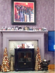
Okay, positively the last one, for now.  I've no more room on my mantelpiece.


This is the one I made today...


This one is a Tudor thatched cottage, and I've altered the die cut to add another window. This was achieved by cutting out two sets of the dwelling and then snipping off the window on the right and left side of each of the second set, including the tab, and glueing those to the tabs on th first set, so adding an extension. I also had to add an extra strip to the roof piece - though take care which side you add the piece to as I put it on the wrong side to start with and so the dormer didn't sit in the right place.  I'm sure you'll not be as stupid as me though.  

The beauty of 'black and white' houses is that they tend to be a bit on the squint, so any mistakes can be put down as historical accuracy.  For instance, I made my back extension a little too wide and now the back of the cottage is slightly curved. ;-) but that's fine by me. But my one big piece of advice when doing a black and white house is to draw all the lines before sticking the walls together. It makes decorating so much easier.

I had such fun drawing the lines. Google 'black and white Tudor house' and you get some amazing images to work from.  And if your hand is a little wobbly then that adds authenticity too. These houses are NEVER made in straight lines!

The windows in made slightly differently this time. I used some frosted paper one of last year's Xmas cards. This paper had some images on it so I cut away the mostly blank bits, and used those. I kept a couple of pieces with images and coloured them in using alcohol ink pens so you can see a Xmas tree, parcel and a star through the front windows. I had decided not to do diamond panes of glass, but it didn't look right once I the Windows were stuck on. I drew panes with a graphite pencil and actually like this technique better than using the ink pen like I did on the pub. Can get window panes much more to scale.
 
I cut out another door using a bit of card with spare window from the cannibalised set. I made this a rectangular door as the curved one just isn't right for a Tudor house, I painted it black and covered it in glossy accents so it looks painted.  The wreath decoration is a snip from a jewelled ribbon that I coloured with alcohol ink.

The thatched roof is felt sprayed th adirondack espresso ink, and the dormer has been shortened so it doesn't stick out over the roofline by much. I had to hand cut the snow felt as the roof is a little longer due to the extension. I made the chimney in red 'Tudor bricks' (barn door and fired brick distress pens).  

These little house look amazing when lit with a battery operated candle. I can't wait for Xmas day when I can switch them all on.


Merry Christmas everyone.